Round Rock Donuts
Responsive Web Design for a Local Business
Re-designing the website of a local business to improve its digital presence and help bring more customers in the business.


Project Overview
Round Rock Donuts is a very popular local and tourist attraction in Round Rock, Texas. This store has been in existence since 1926 and its popularity comes from the distinct yellow color of the donuts which comes from fresh eggs as written in the website. People also marvel at the unique Texas sized donut which is 14-inch wide.
The store has an existing website that shows their menu and their 2 locations. Pre-orders and call ahead orders are only allowed for quantities of 20 dozens and above and customers need to call the store to place the order.
In this website re-design project, we updated the look and feel of their existing website with the goal of making it easy to use and navigate while enhancing some of the useful features it already has.
My Role:
UX/UI Designer
User research, research synthesis, user personas, task flows, sketching, wireframing, prototyping, usability testing
Key Skills:
Figma, Figjam, Google Meet, QuickTime Player, Cloud Convert
Tools:
Project Duration:
80 hours
Background
Regardless of where we live in the world, there is likely to be a local restaurant that people know and love, just like Round Rock Donuts. Like any other local business, an excellent experience is what brings customers coming back. This often includes one’s digital presence.
By ensuring the local business has an updated website that’s easy to use and navigate while providing useful features, we, as UX Designers, can help bring more customers to these businesses to keep downtown areas alive.
Problem
Round Rock Donuts has an existing website that shows their menu and the 2 locations of the store but only allows for a very limited online ordering option.
Pre-orders and call ahead orders are only allowed for quantities of 20 dozens and above and customers need to call the store to place the order.
Solution
A website re-design with enhancement of existing features and services such as online orders.
By updating the look and feel of the website and enhancing some features, customers will be able to navigate the website easier and with improved user experience. Enhancing the online ordering feature will also assist in a faster ordering process which can attract new customers and help keep the existing ones.
Project Goals
1. Develop an MVP responsive design that focused on an eCommerce experience for food online ordering and pick-up service
2. Determine needs and pain points of users to be able to maintain Round Rock Donut’s existing customers and attract new ones
The Design Process
Empathize
To be able to determine the important factors to consider in the website redesign, I had to fully understand the needs and pain points of customers through a carefully planned research. I was able to do this by using Research Methodologies such as existing website review, user interviews and conducting a Competitive Analysis.
Existing Website Review
To begin the research process, I analyzed the existing website of Round Rock Donuts and identified the areas needing attention and improvement.
No sign up or log in option to create account.
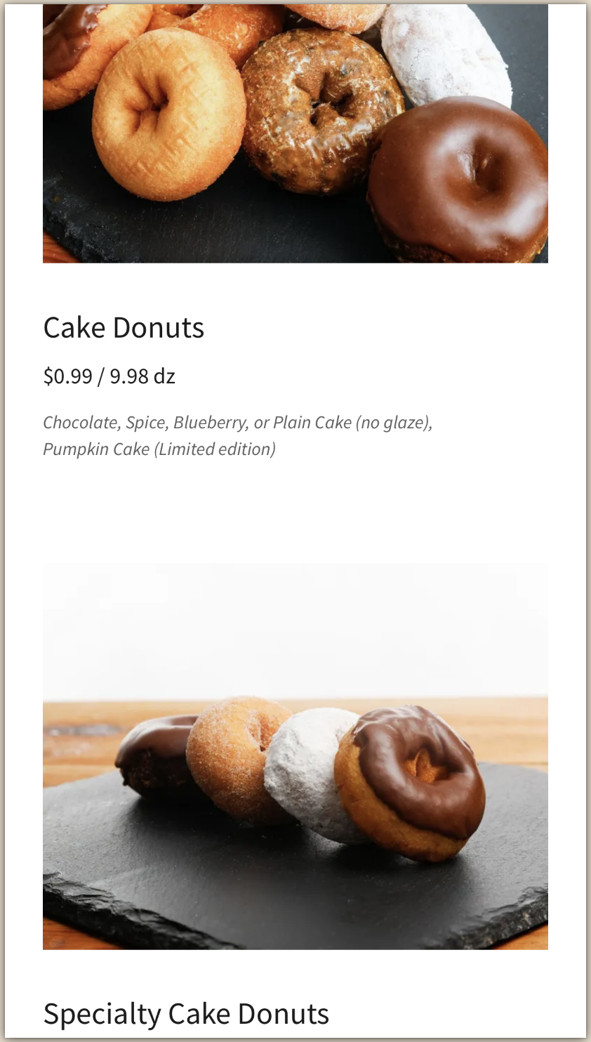
Cart Icon exists but no CTA button to order. Once Menu is clicked from the location, it then shows that pre-order & online order can only be placed if ordering 20 dozens or more of donuts or kolaches. Only cakes can be ordered online.


Some design inconsistencies are present such as:
1. The Round Rock location shows their product while Cedar Park location shows their store
2. The actual donut sizes are the same but are represented by images showing different sizes


The images show different kinds of donuts which do not correctly represent the menu item labels (see left).
The same images were used for different menu item cards.




User Interviews
I conducted phone interviews to 5 participants to gather information on user experiences and pain points when buying from food retailers including Round Rock Donuts as well as when using the establishment’s website.
Research Goals:
1. To understand the main reasons customers use a food retailer’s website
2. To determine the pain points and needs Round Rock Donut customers have when using the website
3. To determine if having an online ordering system for order pick will attract new customers and increase the existing customer’s number of visits and amount of orders from Round Rock Donuts
Research Questions:
1. Why do users access a food retailer’s website?
2. What do customers and non-customers like about Round Rock Donuts’ current website?
3. What do customers and non-customers want to see on the current website?
4. What will encourage customers to use the online ordering system for order pick up?
5. What will attract non-customers to start accessing the website and start use of the online ordering system?
Key Insights from User Interviews
1. 5 out of 5 participants are familiar with the local business (Round Rock Donuts) but only 2 knows about their website
2. Online ordering and rewards system stand out to be the main reasons on the choice of stores and access of websites
3. Online ordering and rewards system are the top 2 features mentioned by users that they would like to see in the RR Donut website
4. 5 out of 5 users would use the online ordering system if available
5. 5 out of 5 users stated that the presence of online ordering system for advance ordering will encourage them to buy more often in Round Rock Donut
Competitive Analysis
I compared the websites of 3 donut shops (Dunkin Donuts, Krispy Kreme and Duck Donuts) and 3 other food establishments (Chipotle, Domino’s Pizza, Tiff’s Treats and Chik-Fil-A) to understand the current market & determine the websites’ strengths, weaknesses and features.
Dunkin Donuts
Account creation, online ordering & rewards program available
Clickable menu items
No option to create favorites list


Krispy Kreme
Account creation, online ordering & rewards program available
Clickable menu items
Suggested items to try at bottom of list
No option to create favorites list


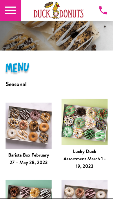
Duck Donuts
Online ordering & rewards program available
Clickable menu items
Option to customize order in terms of coating, topping and drizzle
No option to create account and favorites list

Chipotle
Account creation, online ordering, rewards program and option to create favorites list available
Clickable menu items
Suggested items to try at bottom of list
Video on homepage adds personality to website


Domino’s Pizza
Account creation, online ordering, rewards program and option to create favorites list available
Clickable menu items
Suggested items to try at bottom of list
Video on homepage adds personality to website


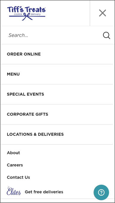
Tiff’s Treats
Account creation, online ordering, rewards program and option to create favorites list available
Clickable menu items
Option for multiple recipients in one order available

Key Insights from Competitive Analysis
1. Having an online ordering option and rewards system is common not only in similar businesses to Round Rock Donuts but across different businesses as well.
2. Of the 6 businesses compared, only 1 didn’t have an account creation option.
3. The menu items are clickable for all 6 websites.
4. 3 of the 6 businesses allow for creation of favorites list to allow for faster ordering in the future
5. 3 of the 6 businesses provide a list of suggested items to try which is a good marketing strategy to encourage customers to try other products
Define
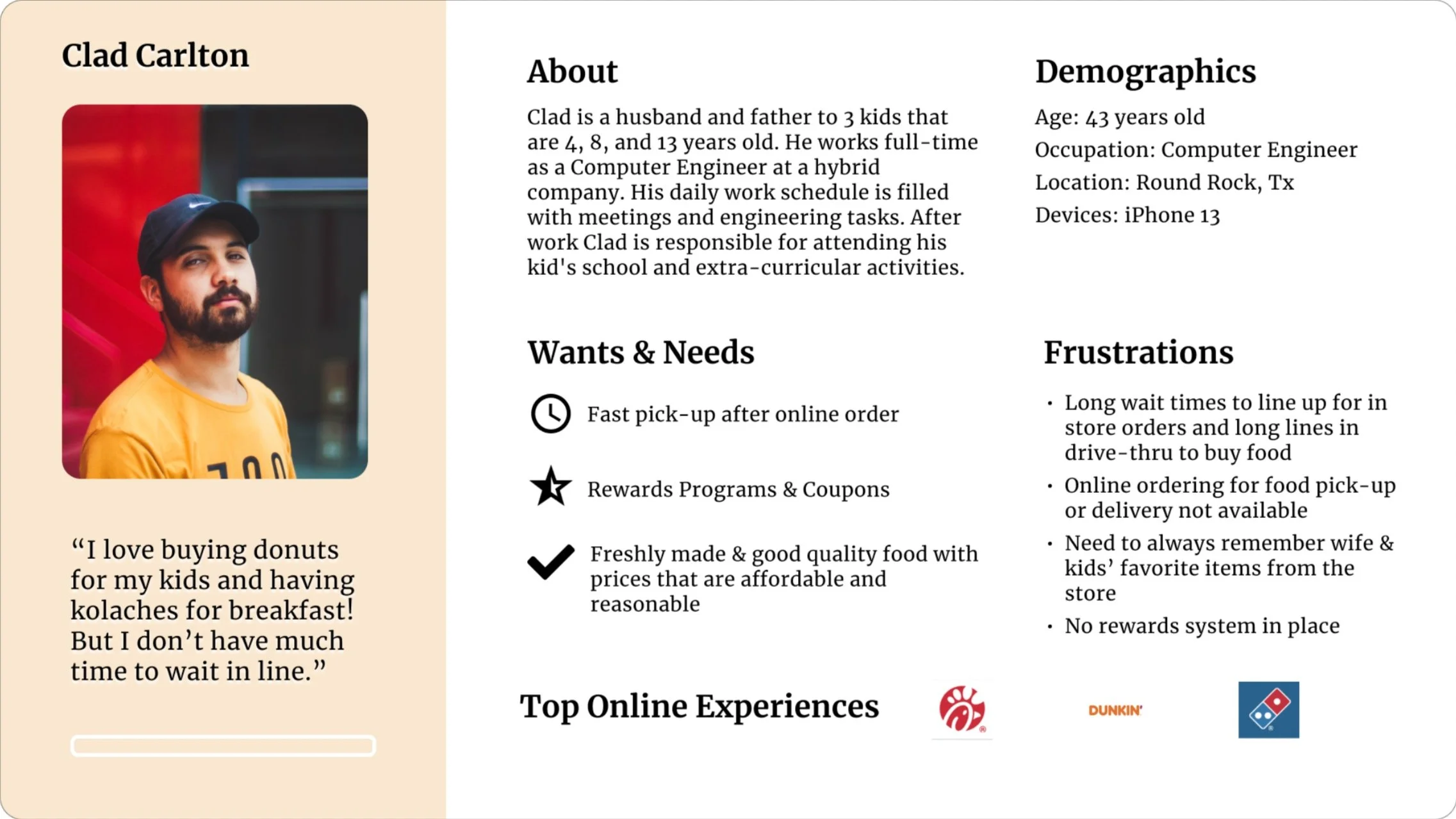
Meet Clad, a husband and a father who works full time. For him, freshly made and good quality foods take priority and being able to get it a fast is a must because of his very busy schedule. He loves Round Rock Donuts but the long wait times and absence of ability to order online make him choose other stores instead.
Ideate
Based on the results of the researches conducted, I was able to determine the 3 most important tasks the users have to complete:
Task 1: Account Creation for Online Ordering

Task 2: Online Ordering for Drive-thru pick up
(assuming that user just finished Task 1 and is still on the Account Creation Confirmation page)

Task 3: Creating “Favorite List” that will allow faster future ordering
(assuming that user just finished placing the order and is viewing the Order Confirmation page)

Sitemap
I created the website’s site map to allow me to visualize how the individual web pages and site sections are related to each other and how to improve the website based on the researches I completed.

Design
Sketching Low Fidelity Wireframes
I started creating the design by carefully studying the existing Round Rock Donuts website and reviewing the results of my researches. I then sketched my low fidelity wireframes focusing on the key pages and features I wanted to highlight.
Task 1: Account Creation for Online Ordering
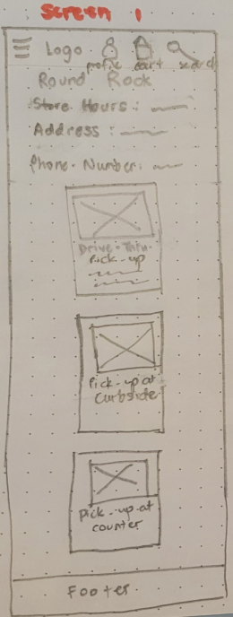
The first thing I needed to do was add the sign up and login CTA’s to allow users to create an account so they can start ordering online. I needed to make sure that the two locations are clearly stated to avoid confusions during pick up.


Task 2: Online Ordering for Drive-thru pick up
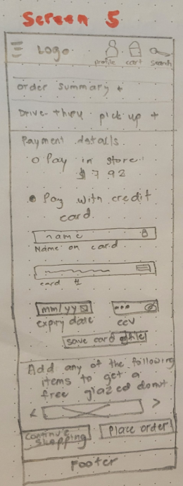
I sketched the following low-fi wireframes taking into consideration that there are two different locations and 3 possible modes of pick up for online orders. I also included some suggested items in the order summary page based on one of the practices seen for other businesses based on the competitive analysis I did.



Task 3: Creating “Favorite List” that will allow faster future ordering
By creating a favorite’s list, users will find it easier and faster to complete an order in the future. This can be a good marketing strategy and is seen in 50% of the business I compared in my competitive analysis.


Digitizing My Designs in Mid Fidelity Wireframes
shown below are only the mid-fidelity screens with the most significant changes made
Screen 1: Homepage
Cart icon added for online order


Text updated to make it less dense visually
Added CTA button in each location for easier check out


Font style changed to improve visual accessibility


Screen 2: Account Creation Confirmation Page
Changed the style and arrangement of the item cards from 2 columns to single column in mobile device for improved visual clarity and to avoid making the pages look so crowded


Moved cart icon directly under the menu items before suggesting other items for purchase to avoid confusion for users
Changed suggested item card styles to avoid the text from overlapping the images. Also added back and next arrows to make it clearer for users that there are other items that can be viewed


Converting my Designs to High Fidelity Wirefames
Homepage

Sign up page added so users can create an account with options to use other ways to sign up such as through Facebook, Google and Apple.
Color palette based on existing website design to maintain branding and customer familiarity
Image of the locations updated to make the two location cards consistent with each other
To make the CTA’s more visible and eye catching, a shade of yellow was used to make it consistent with the logo as well as to represent the yellow color of the glazed donut the business is well known for.


Sign Up Page
Account Confirmation Page
Menu Page

Changed the style of the menu item cards to allow users to choose the quantity and order online using the added CTA button for “Add to Cart”
Order Summary Page
Favorites Page

In this page, users are given the chance to name their own favorite order as well as a chance to edit the items and quantity before creating their favorites list.
A confirmation is given to users once they finish creating the account. The account profile icon now appears on the navigation bar and they’re also able to choose the locations for online ordering.

The pick up location is shown again to allow users to confirm their initial choice of location. The change and edit options are included in the location and item choices to assist users if any change is needed.

Favorites Summary Page

The name of the favorite list is shown with the option to order as it is or to add more items to the favorites.
Prototyping
Once the designs were finalized in hi-fi, I created an interactive Figma prototype for usability testing in order to evaluate my designs & proposed user flows across the 3 key tasks I identified above.
Usability Testing
Testing Goals
1. Evaluate design usability in terms of user’s ability to clearly read the text and their acceptance of the color palette and contrast used in the website
2. Determine if users are able to sign up to create an account, order online and save their last order as a favorite to speed up the process for their succeeding orders while navigating the website with ease and minimal to no errors
3. Identify and list areas of error and confusion in the tasks provided
4. Gather user feedback on the adequacy of information and graphics (pictures & videos) provided in the website.
5. Record the total time that users can complete the tasks and determine if this is an acceptable time for potential customers.
Test Methodology
Participants were asked to perform the usability test and were moderated using one of the following methods:
1. 3 participants were directly observed in person while they navigated the website and completed the task
2. The other 3 participants were observed through screen share using google meet
Participants
I had 6 participants, 3 of them were part of my user interviews at the start of this project and 3 are new ones.
Usability Test Results and Analysis
Task 1: Account Creation for Online Ordering

6 out of 6 participants considered Task 1 as very easy (5)
There was no confusion during task completion
Comments: Easy to follow, the words helped me to complete the task
Average completion time is 19.78 seconds
Task 2: Online Ordering for Drive Through Pick-up

5 out of 6 participants considered Task 2 as very easy (5) and 1 ranked it as Easy (4)
Comments: Navigation is easy and straightforward,
confusion on add to cart in relation to quantity of orderIteration Needed: Provide feedback when user clicks “add to cart” to inform
user that action has been completedAverage completion time is 85.50 secs or 1.42 mins
Task 3: Creating Favorites List for Faster Future Order

5 out of 6 participants considered Task 3 as very easy (5) and 1 ranked it as Easy (4)
Comments: Easy to navigate, confusion on label for “Name of Favorite”
because it was too close to the next text “Items on Favorites”Iteration Needed: Modify distance and text size to delineate the input field
label with the heading of next sectionAverage completion time for Task 2 is 15.68 secs
Total Time Used to Complete 3 Tasks

6 out of 6 participants completed the 3 tasks in less than 3 mins with the average time being 2.01 mins
Success Metrics
1. Positive Feedback on the easy readability of the text and users’ acceptance of the color palette and contrast used in the website
Comments: Text is easy to read, clear
Color matches the logo and consistent with the brand
2. Completion of tasks presented and zero errors made during the process
Comments: No error but delay in completion due to confusion (see Task 2
and Task 3 tables)
Solution: Iterations to be made in Task 2 and Task 3 screens where confusion occurred
3. Users are able to identify any errors and confusion they encountered and provide recommendation on how the experience can be improved
Result: Users were able to identify confusion and provide recommendation
4, Users would find the number of graphics and amount of information provided is adequate
Comments: Good size of graphics, good images, adequate information, no allergy information
Solution: Explore adding ingredients page and allergen information for individual products as next steps for future upgrades
5. Users will be able to complete the tasks in less than 10 minutes which is less than the wait times current customers have to wait in line to be able to get their orders.
Result: All 6 users completed the 3 tasks in less than 3 mins with the
average time being 2.01 mins
“The color was appropriate for Round Rock donuts and the yellow color of the buttons really attract your attention. There were no competing colors. - M.C., Usability Test Participant
“I like the pictures which made me think of wanting to buy donuts because they look really good.”
- D.D., Usability Test Participant
“No confusion, you could see everything and it’s very easy to navigate.”
- E.C., Usability Test Participant
High Priority Design Revisions
Revision #1: Provide feedback to user that order has been added to cart
Usability Test Finding:
User got confused if order has been added because the appearance of the red dot on the cart once item has been added was not too visible.


Iteration:
To adress the confusion, a feedback message “added to cart” appears once user adds the item to cart. The “Add to Cart” CTA also changes to “Go to Cart” to eliminate need to scroll all the way down the page when user wants to go to cart already.
Revision #2: Modify label placement & font style for improved hierarchy & readability
Usability Test Finding:
User didn’t immediately understand what was needed to be done in this page because the “Name of Favorite” is too close & looks similar to the “Items in Favorite” .
Iteration:
Text in the input field was made clearer by indicating what needs to be done “Type Name of Favorite” instead of just “Type Name”. Also used bigger font and centered “Items in Favorite”.


Revision #3: Modify text placement & font style for easier readability
Design Review Finding:
The name of the Favorite doesn’t stand out from the other text so it wasn’t easily noticeable.
Iteration:
The font size and style were changed in name of the Favorite for easier readability. It was also centered in the page for better visual effect.


Revision #4: Modify look of Homepage
Design Review Findings:
1. Cart icon makes top navigation bar crowded
2. Text information about Round Rock Donuts still appear crowded
Iterations:
1. Cart icon removed from top navigation bar to avoid overcrowding
2. Modified & trimmed down text for easier readability
3. Highlighted interesting facts about the donuts using color from logo to improve visual appeal


Revision #5: Improve consistency of images of menu items
Design Review Findings:
1. Donut images are inconsistent with each other
2. Too much white space between menu card and background
Iterations:
1. I personally took pictures of the donuts and used those images to ensure consistency of the layout & appearance
2. Changed card style for better aesthetics & more modern design
3. Added a touch of red in the menu cards to incorporate brand colors & break up white space


Revision #6: Update look of pick up and payment page
Design Review Findings:
1. Actual pictures in the pick up methods can be difficult to see especially in the small circles
2. Gray and white color predominates the page making it look like mid-fi rather than hi-fi
Iterations:
1.Changed actual images to icons for easier recognition and improved visibility
2. Used red instead gray to highlight the different sections such as Order Summary and Payment to support brand colors and improve visual appeal
Round Rock Donuts Homepage in Different Devices
Mobile Version
Tablet Version
Desktop Version
How Round Rock Donut can further improve their existing services
By providing option for users to save more than 1 favorite list for faster ordering
By adding allergen information for the individual items to allow customers to safely choose the food items they can buy .
By adding a delivery option for donut orders less than the current requirement of 20 dozens.
By offering a Rewards Program for customers because this is one of the most common marketing strategies that attract new and existing customers to buy more frequently.
Reflections
I enjoyed working on this project because I was able to know one of our local businesses more not only from trying their products but from really diving deep into the details of their website. I was thrilled to buy the products and take pictures of them so I can use the actual images in the redesign of the website.
In this project, I was able to use both my UX and UI design skills while maintaining the brand and colors which the business is already well know for.
I’m looking forward to actually reaching out to the local business so I can present my ideas and design to them so I can contribute to their existing business and future success.


